Retro is back, baby!
Trit House’s new ‘A Place To Unwind’ range
Everything old is new again – we’re seeing a return to tactility, along with richer colour palettes like deep plums and golden ochre tones. We’ve round up what’s been catching our eye lately.
Top four images: Trit House’s new ‘A Place To Unwind’ collection
Bottom image: Retro Print Revival - Photography Mike Baker /
Styling Tamara Watts
Whilst Pantone have labelled ‘Cloud Dancer’ their colour of the year, at Adore, we think plum ought to be the colour of 2026. Paired with rich walnuts and timber panelling, the look is moody yet vibrant. Layer in some dark green and boom, you’ve got yourself a winning colour combo. We’re seeing more brands and interior designers embracing this retro-inspired look and we love what we see.
Trit House has recently launched their latest collection of furnishings – ‘A Place To Unwind’ (first four images pictured above). Each piece feels right at home in mid-century modern homes, we adore the silhouettes of the furniture along with the tactility of each - think plush velvets, marbles and boucles in rich sumptous colours like plum, espresso and spice. Ooh that sounds utterly delish don’t you think?
Also on our retro radar is Retro Print Revival’s latest collection of lamps. Featuring decadent striped velvet shades (like pictured above), their classic range of mid-century inspired lamps are perfect for those wanting to add authenticity to their mid-century home.
ARMCHAIR / ART / BIRD WALL ORNAMENTS / RUG / ARMCHAIR / LAMP
Another winning colour combo for mid-century homes is golden yellows and mustards combined with chocolate or walnut tones - yum! Bonnie and Neil create stunning and unique cushion designs and we think they’re a perfect fit for achieving retro vibes. The mood board created below shows how gorgeous this colour pairing can be.
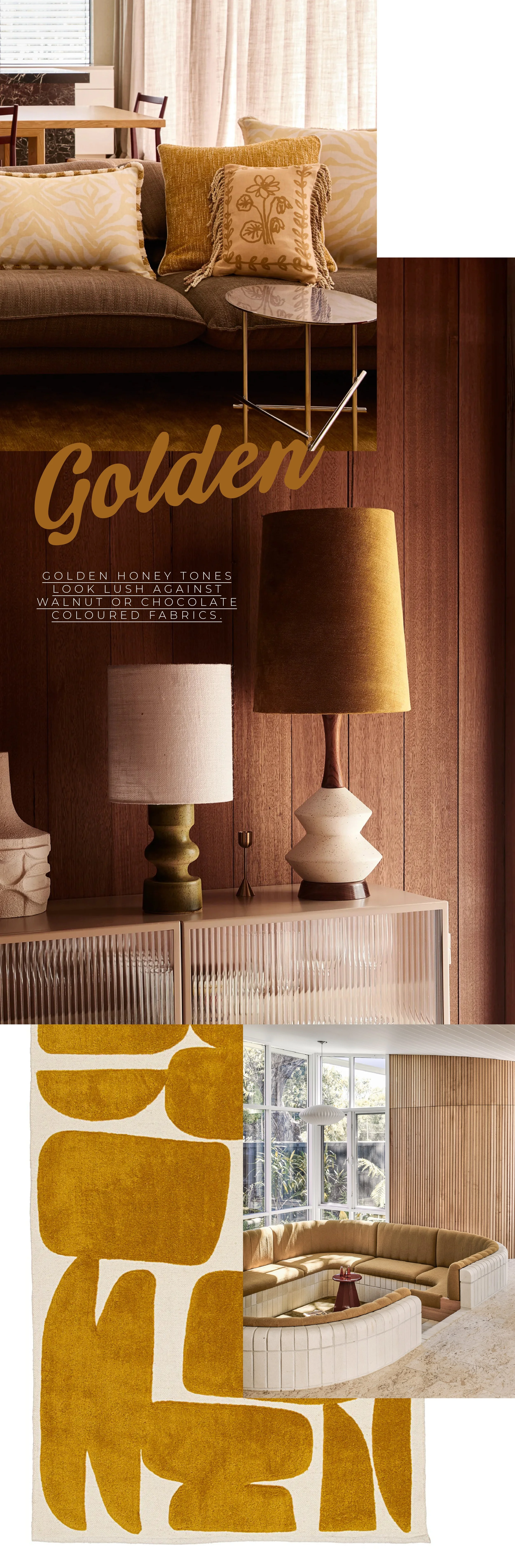
1st image: Bonnie and Neil’s new cushion collection
2nd image: Retro Print Revival - Photography Mike Baker / Styling Tamara Watts / Rug: Miss Amara
3rd image: Architecture Pleysier Perkins / Photography Tom Blachford