Life Instyle Sydney

Don’t miss Life Instyle Sydney, a trade-only event for all things Australian
made, ethical and sustainable.

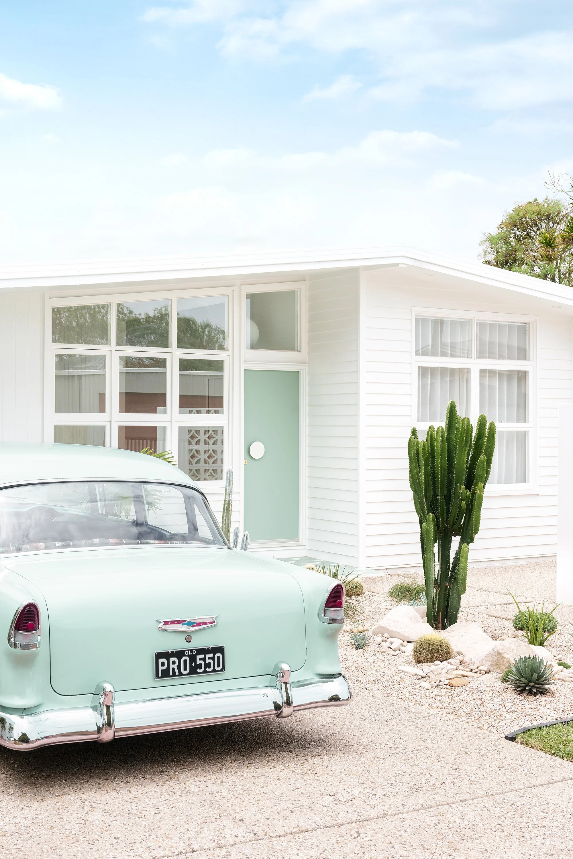
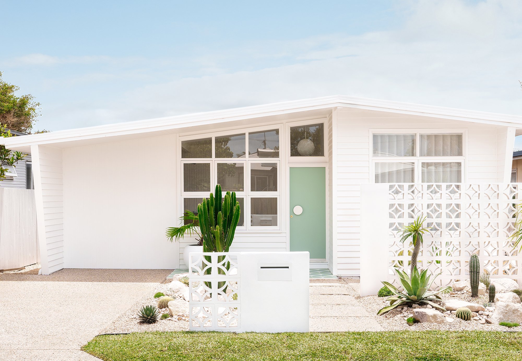
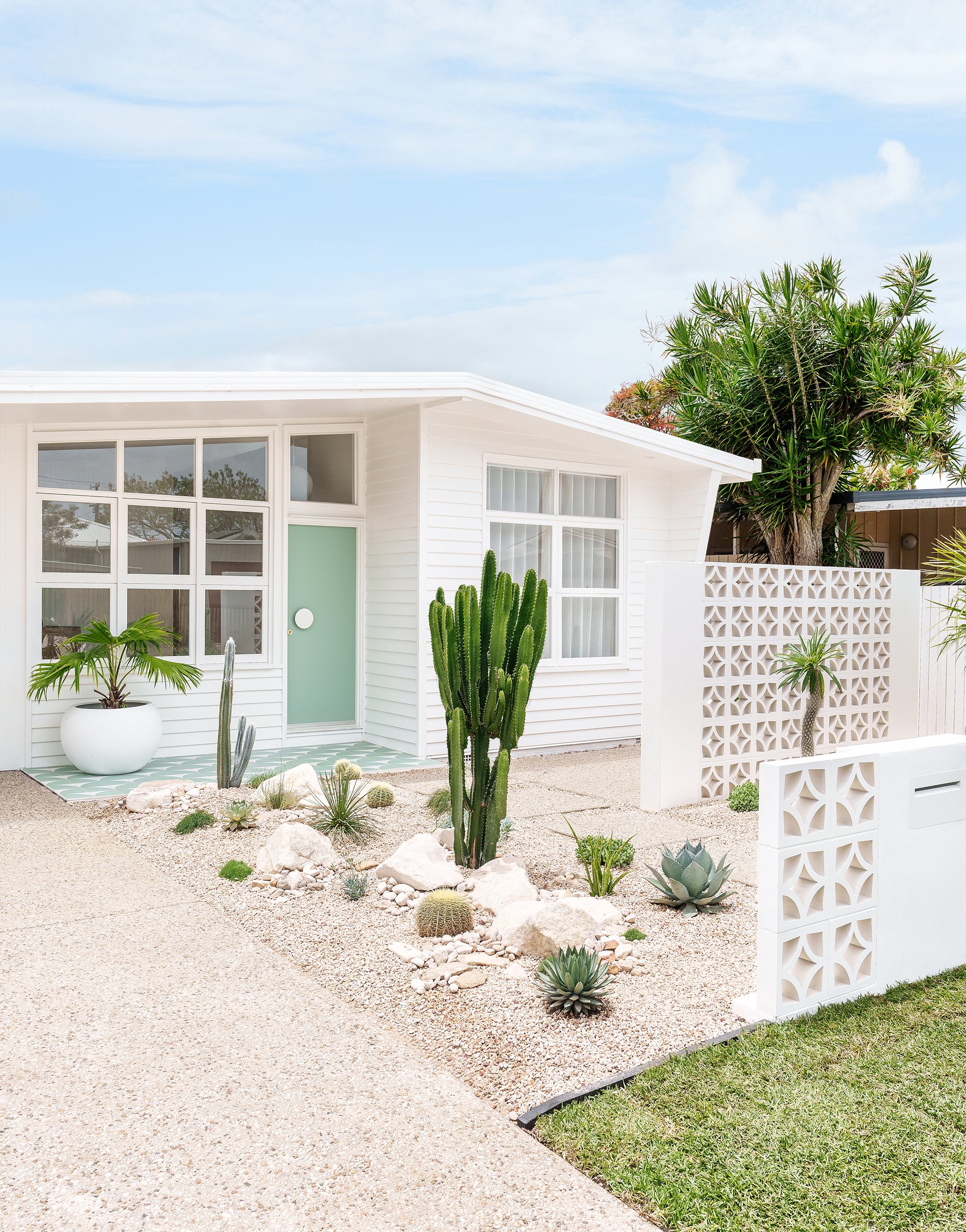
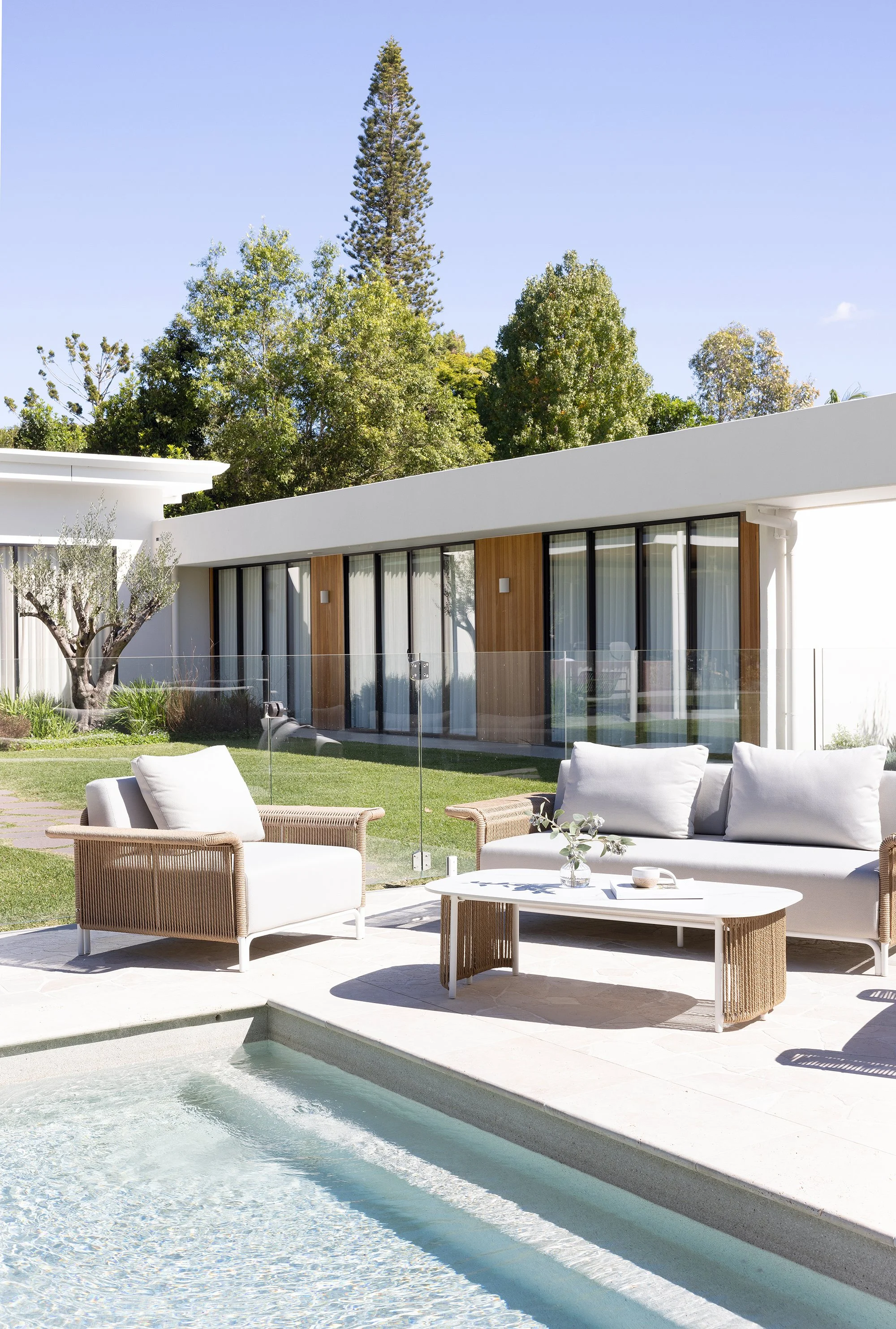
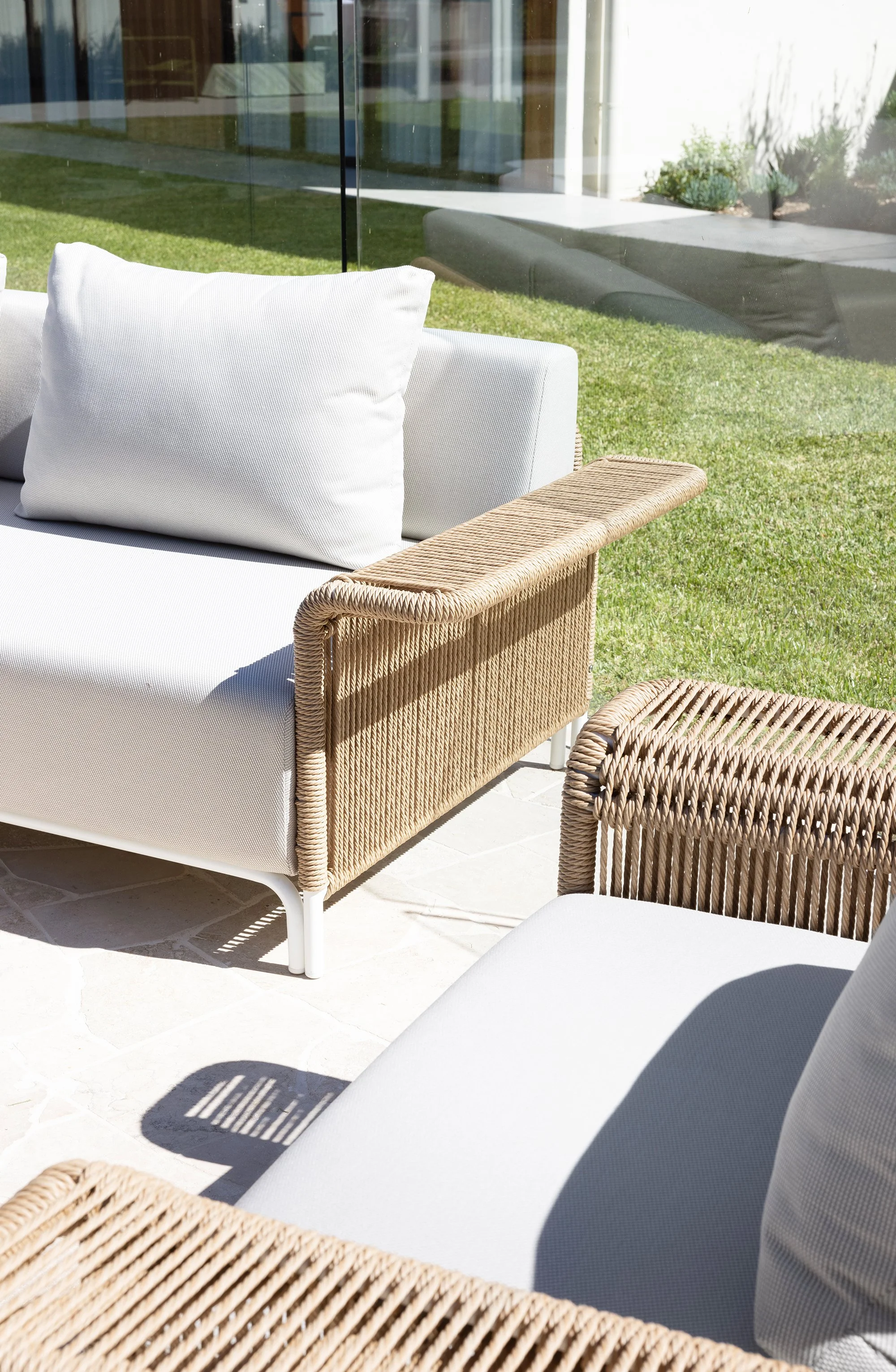
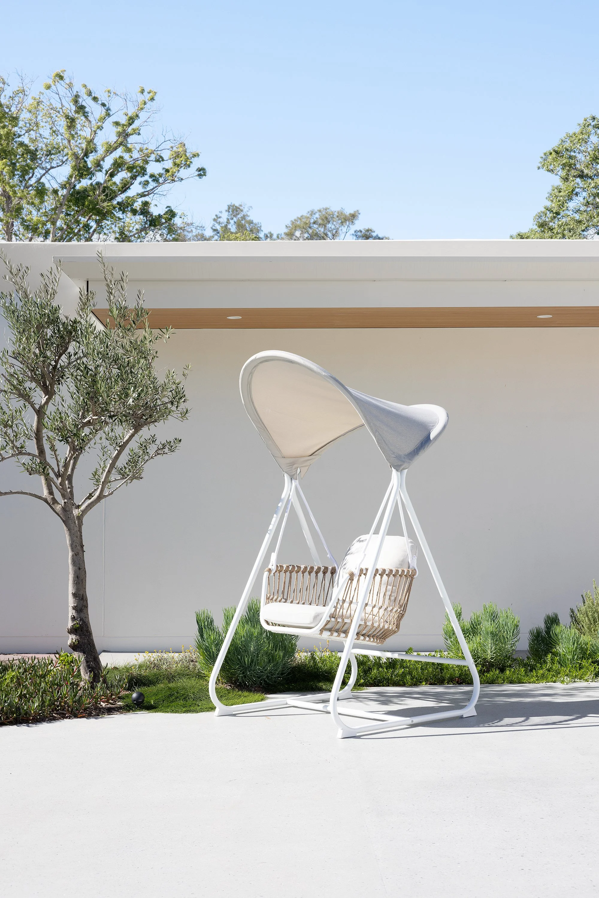
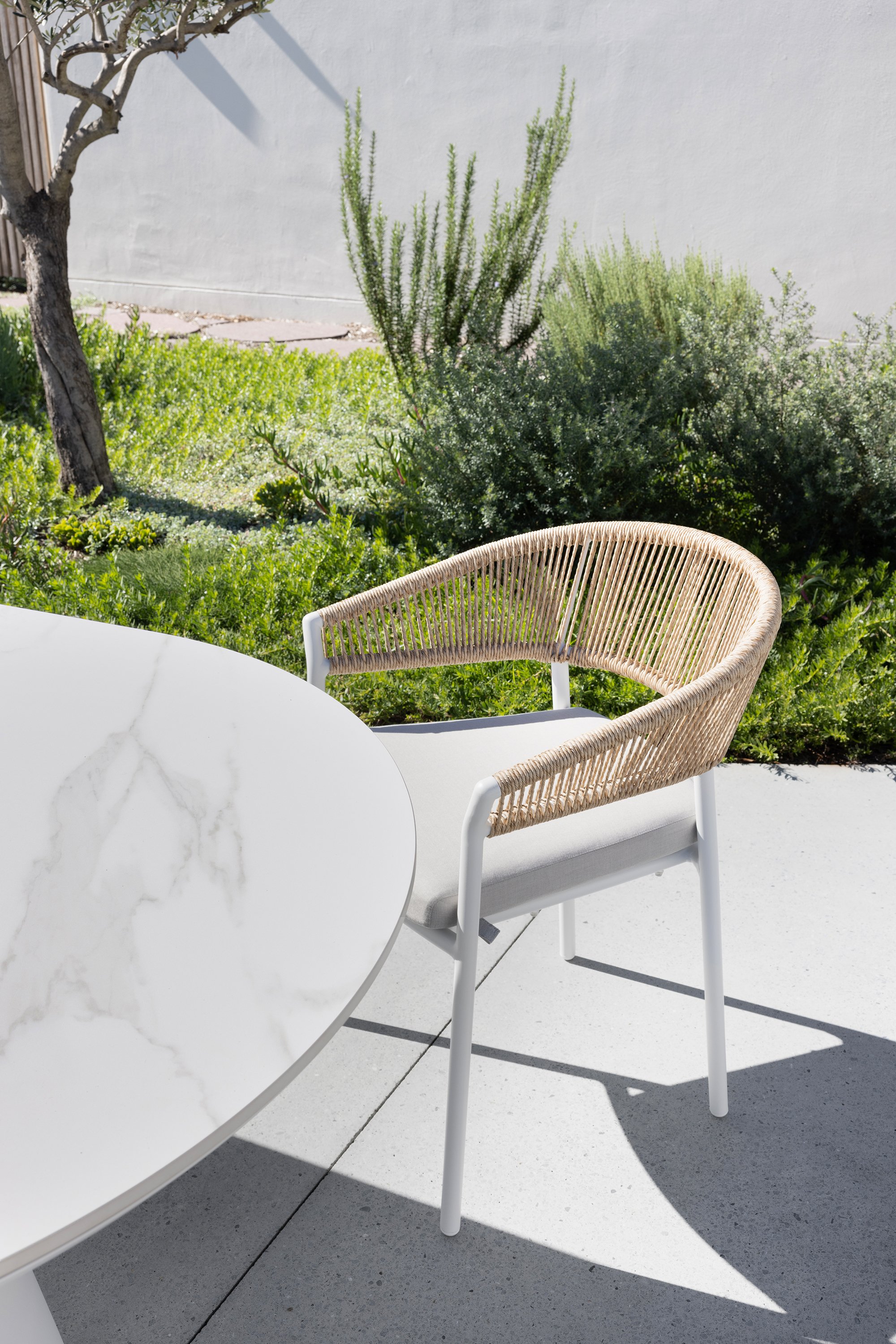
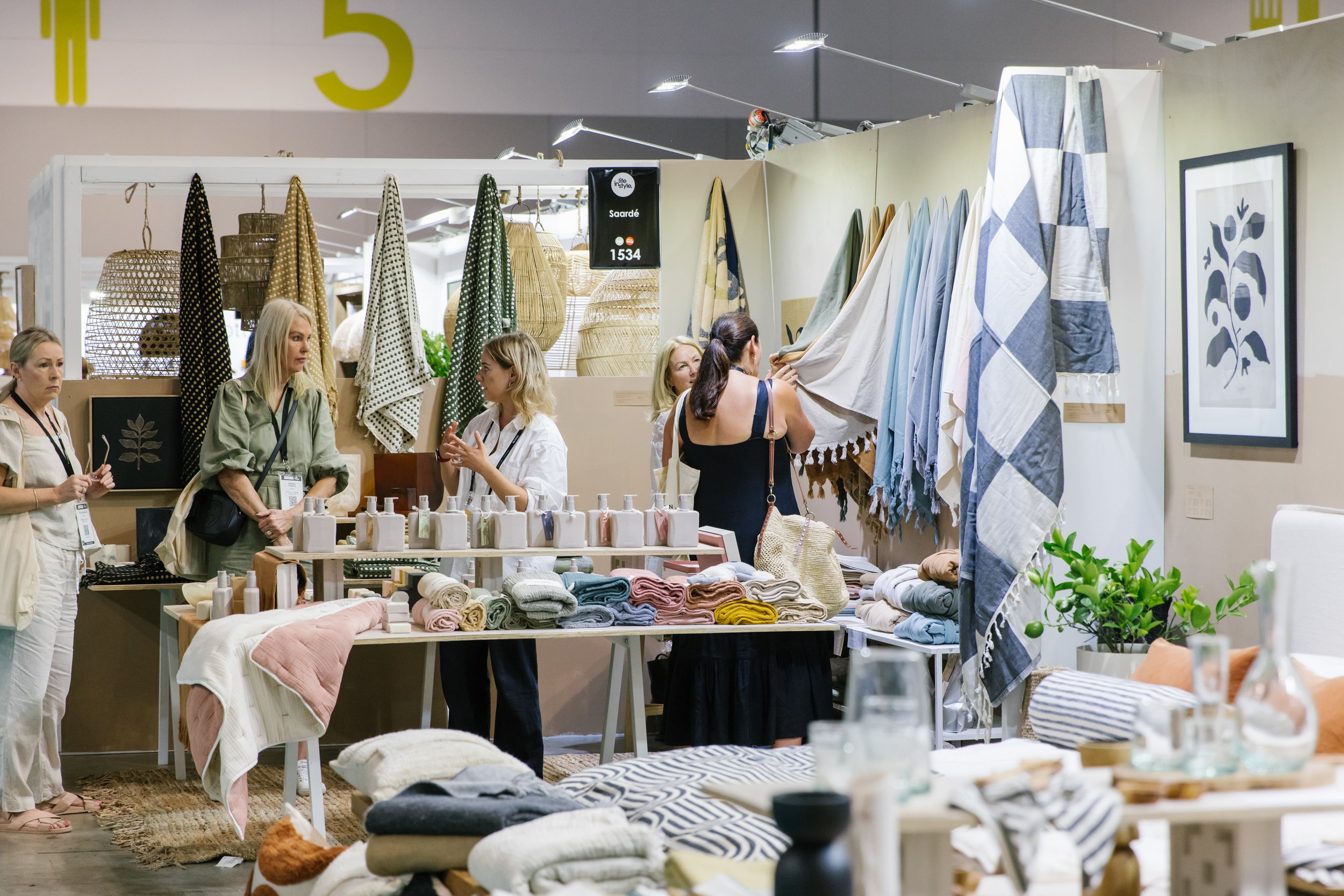
Photography Samee Lapham

Co-located with Reed Gift Fairs, over 500 curated brands will be showcasing their new products. Life Instyle takes place 17-20 February at the ICC Sydney. This boutique event is a great sourcing opportunity for retail buyers and designers looking to stock curated well-designed products, across homewares, lifestyle, kids and fashion.

If you want to keep up on the latest retail trends then don’t miss Retail Therapy. Presented by leading experts in their field, Retail Therapy will equip you with the know-how to evolve your business and take your customer experience to the next level.

The Style Studio, Life Instyle’s new feature area, is your go-to inspiration to see a live photoshoot in action with products from Life Instyle exhibitors. Hosted by The Life Style Edit, it will show you how to bring together beautiful products and innovative styling to design stunning sets each day to create some amazing images to be used online and in print.

Another exciting feature area is The Business Couch. Here visitors have the opportunity to receive a complimentary one-on-one business consultation with either The Life Style Edit, thelotco, and NW Creative Studio. With their vast experience consulting on retail, wholesale, pricing, marketing, sales and so much more, get the insights and advice you need to move your business to the next level in our a bespoke 45-minute session.

Don’t miss out on four days of sourcing, networking and education and register now for your FREE ticket.

Higlett House Front entry + Exterior

This has to be my favourite transformation of our home - the front facade and garden. We’ve embraced our home’s mid-century modern roots, and turned the front into a Palm Springs style oasis.

Photography Coastpark Creative

Front exterior before

BEFORE

Our home was built in 1960 and had a great shape - long and lean with winged details on the sides and clerestory windows. However, whilst it might look like we just painted the front of house, and did a little bit of landscaping, there’s actually a lot more to it than meets the eye. The house was completely clad in a vinyl cladding that looked like weatherboards (but wasn’t). And underneath it (on the front) was asbestos fibro sheeting with paint that was bubbling and flaking off. The whole front of house needed to be re-clad. Fortunately the sides of the house had real timber weatherboards under the fake vinyl ones so we were able to save most of it (with the exception of some bowed boards being replaced). And due to some structural changes we were going to make inside, we had to re-make the front living room windows and clerestory windows to replace the existing ones due to a structural beam that needed to be added (right where the windows are - scroll down to see our front entry inside as it makes more sense when you see the beam placement). That was heartbreaking and a massive blow to the budget as we hadn’t planned on replacing those.

There was not much of a garden out the front either - a lonely rose bush, and a million and one hexagon pavers (which we later found out were all hand made by a previous owner in the 90s). They weren’t our style and we gave away most of them on marketplace.

AFTER

The whole front needed to be re-clad and we needed something that would be tough and weather resistant. Our home is close to the beach and I wanted to retain that mid-century beach shack vibe by cladding in Linea™ Weatherboards by James Hardie. Painted in Tabumans ‘Crisp White’ it looks so fresh and makes a statement in our street.

Another major change to the home was closing in the ‘carport’ and I use that term losely as you couldn’t actually fit a car in there, and combine it with the front living room (which was formerly used as a bedroom) to create a larger, more usable space. This particular zone was clad in Axon™ Cladding by James Hardie. It’s a VJ style cladding and is super quick to go up, easy to paint and complements the Linea weatherboards with its coastal feel. Our eaves are clad in Hardie™ Groove Lining by James Hardie which again looks like VJ but is exterior grade to hold up to the weather. Believe it or not, this is actually one of my favourite features on the home. When you look outside from the main bedroom and front living room you can see the overhang of the eaves and that VJ just looks so coastal.

Other things we added were a new fence, aggregate driveway, breezeblock screen wall and Milkcan built-in letterbox, along with a cactus garden and brand new turf.

THE COURTYARD

This space looks like a dream and I couldn’t be more happy with it. Obviously breeze blocks were a must for our home, and I’ve always loved the ‘Star’ pattern ones. I sourced mine from The Breeze Block Co, a local company which specialise in breeze blocks. If you’re stumped as to what pattern to use or what it could look like, Candice the co-owner of The Breeze Block Co can actually design it up for you (for an additional fee). I hired Stella Brick and Blocklaying to build my breeze block screen wall along with the custom letterbox with breeze blocks and they did such a great job. I am so happy with how it turned out. I then had the letterbox and columns on the screen wall rendered and painted those in Tint ‘So Fresh and So Clean’. Would you believe I still need to do 1 more coat on these, you can’t tell in the photos luckily!

Now this little open courtyard is a nice spot to sit with an afternoon drink and soak up those garden views! It also looks gorgeous from our main bedroom which overlooks this space. It’s really elevated the way our home feels on the inside (not just the outside). Umbrella, stand and sling chairs from Business & Pleasure Co, pots from The Balcony Garden, side table from Kmart.

‘Halo’ entry door pull in white / Front door painted in Taubmans Silver Leaf and house painted in Taubmans ‘Crisp White’

THE FRONT DOOR

In Palm Springs, colourful doors rule the town, so we wanted to embrace that, and have a little bit of fun with colour for our door. I chose Taubmans ‘Silver Leaf’ for the front door which is a nice soft minty green. The door itself was an inexpensive one from Bunnings. To dress it up I chose a statement door handle (‘Halo’ entry pull) from Lo & Co. It ties in with our whole Palm Springs vibes and I just love it!

THE TILES

Nothing says Palm Springs like a bold patterned tile and for our front entry I wanted something that was a little bit retro and that also matched the colour of our front door. When I couldn’t find anything quite right, I reached out to my friends at Tile Cloud to see if they would be interested in collaborating and creating this fun quarter-circle patterned tile in a matching colour to my door. When they said yes, I was so excited. I had mine laid in an arch shape pattern to create a fun pattern (which also made my tiler’s eyes go cross-eyed after a while haha). The tiles are called the ‘Adore’ tiles from Tile Cloud and they’re suitable for both interior and exterior use. I’m so over the moon with how it turned out - it’s quirky, unique, a little bit retro, and very fitting for our home. The versatility of this tile is endless though and you can create lots of different patterns with the quarter-circle.

THE FRONT ENTRY

Nothing is more quintessentially Palm Springs than an orb pendant light so it was a very obvious choice for us to use this Orb Max XL size pendant from Lighterior in our entrance. It is beautiful - and you can see it through our clerestory windows which also complements the bones of our mid-century home.

Running down the length of our hallway is Surround By Laminex ‘Scallop 135’ panelling. We wanted to add interest to the walls in this space, along with the ceiling (which is clad in VJ panels).

Entry before

Entry after

Higlett House Living Room Reveal

Our living room has been completely transformed into a light and airy space. Here’s the full tour.

Photography Coastpark Creative

BEFORE

We were fortunate enough to have this large living room extension already here (which a previous owner added in the 90s). It was a fairly spacious room however it did feel very divided from our kitchen in the room next door. There were a number of small windows too, and made the whole room feel disconnected from outside. By removing and adding in two sets of stacking sliding doors, we were able to bring the outdoors in and allow so much more natural light in (which is hugely important in any reno). No one dreams of a dark and dingy house do they?

We also connected this space to our kitchen by removing the dividing wall (however this did mean we needed to add a couple of structural beams). The living room was fairly big, so we pinched some of the space in here and added it to our new kitchen. The other half of the kitchen space went to our guest bedroom (we did quite a bit of reshuffling of the floor plan to make it work better).

Our red hardwood floors were also replaced - you can’t really tell but it’s a different looking timber to the rest of the house and because of all of the floor plan changes the best thing to do was completely replace the floorboards and lay new flooring over the top. We chose the ‘Refined Oak’ in Hamptons engineered timber flooring from Carpet Court and it has made such a massive difference to the way the home feels. The red flooring just looked so dark and heavy, whereas our new lighter flooring just makes the home feel more modern and light.

Before living room

Before and After

CURTAINS + BLINDS

Large sliding doors have allowed so much natural light into this space, which is great, however with the room being north facing it can also get very hot. To help diffuse that light and the glare in here, we have installed ‘Tahiti Snow’ sheer curtains from Tuiss Blinds Online. The white curtains go so perfectly with our white walls and VJ ceiling (painted in Tint ‘So Fresh and So Clean’). Not only do they help reduce the glare in the room, they also provide day time privacy. For night time privacy and full blockout and relief from the heat, we have chosen the Moda White electric blockout blinds from Tuiss Blinds Online. I think it’s definitely worth the extra money to have motorised blinds as you can control them easily via a remote control (plus no unsightly beaded cords). The ones I have also have the ability to be programmed with the SmartView App, allowing you to control the light effortlessly from anywhere in your home with a touch of your phone’s screen.

FURNISHINGS

I was fairly deliberate in the furniture I selected in terms of scale. I didn’t want ultra bulky furniture so chose a more slimline style sofa from Life Interiors. This is the ‘Bronte’ three seater sofa in an off-white colour. I love the timber leg detail on this one! Plus it’s super comfortable and you can tell the quality of it is great too.

In the corner of the room we have a gorgeous boucle and rattan armchair from Bay Gallery Furniture. This style is called the ‘Kilara’ and it ties in so well with our bar stools from Life Interiors and our coffee table. I love sitting in this armchair, it’s the perfect spot to relax in the afternoon.

Our ‘Lauria’ coffee table is also quite narrow and streamlined, this one is a cheapie from Lifely. I will say this though, the first one arrived damaged and they replaced it with another one that was damaged in the same spot, so I can’t really say I recommend this piece (although it does look nice apart from that fact).

STYLING

I love to style with foliage, flowers and plants and I’ve used all three in this room. The fiddle leaf fig tree adds a lot of life to the space and I think it will be pretty happy in that corner by the doors.

I think rugs really help to define spaces and on the floor in our living room we have used the ‘Rolini’ rug from Miss Amara. It’s made from wool, it’s super soft and I just love the geometric pattern. It has a little bit of a retro feel and a perfect fit for in here.

Palm Springs Edition Sneak Peek

It’s almost here - our Palm Springs edition promises to deliver inspiring homes that channel their own take on Palm Springs style. Here’s a look inside…

Photography Coastpark Creative shot at @higlett_house (Also featured on the front cover)

I’ve long wanted to do a Palm Springs-inspired edition. After all, it is my favourite city! In this edition, we venture inside three homes with distinct interpretations of Palm Springs style. Among them is my own home (pictured on the front cover) – a 1960s beach shack that my partner and I have lovingly restored over the past year. Our Mid-Mod style report shows you how to add a little mid-century modern flavour to your home. And we check out a Palm Springs-style façade facelift, and take a tour of award-winning display garden, Aurum. New issue due to arrive 8 December in the Adore online shop, and in newsagents from 18 December.

Photography Hannah Blackmore for Slugg, shot at @sundowner_house

Photography Erik Holt / Landscape Design Mint Design / Build TLC Pools with assistance from Habitat Construction

Higlett House Kitchen Reveal

All of my sage green dreams have come true with our new ‘Bayleaf’ kitchen! This hard working space also doubles as our laundry. Here’s the full tour.

Photography Coastpark Creative / Joinery KitchenU

I just love my new kitchen, we had made some tweaks to the original plans, I had originally wanted a curved island, but when I got the quotes back my budget said otherwise. I stumbled upon KitchenU when googling for cabinetmakers and they were fantastic. Right from the get-go James from KitchenU called me back to discuss my plans and even made some very helpful suggestions in order to cut costs down after I explained my budget woes. It’s not every day you get someone going out of their way to help you with ideas to slash the price. He suggested not to do a curved island (because they’re expensive) and instead just have the demi round panelling on the front of a rectangle island. My original plans also had pocket doors on the appliance cupboard and European laundry. James said if we did bifold doors on the laundry and standard doors on the appliance cupboard we could cut a lot of cost there too.

James’ mum Kathie (who is a well-known kitchen designer in Brisbane) was assigned to me for the rest of the process, and she was just so lovely to deal with the whole way. If there were any hiccups along the way, Kathie would always be there to fix it. I can highly recommend them and in fact, my mum is using them on her own cottage renovation.

KITCHEN BEFORE

MATERIALS + COLOURS

In our last home’s kitchen (click here to view), we did a very white, neutral kitchen, and whilst there’s absolutely nothing wrong with that, I did want to push myself out of my comfort zone in our new home and have fun with colour. Lately I’ve been a little green-obsessed and decided to go with Laminex ‘Bayleaf’ for our kitchen cabinetry. The colour is so good, I love how fresh it looks and how it changes depending on the light. It’s a really calming green and looks good used with splashes of white.

For the walls and ceiling we’ve used Tint ‘So Fresh and So Clean’ - it’s a true white white, and doesn’t throw any other colour undertones. The coverage is fantastic too - it’s a beautiful thick paint and low in odour too. I had our ceiling in the kitchen/living area clad in VJ panels and it looks so good painted in this white!

Another major material for our kitchen is the Silestone ‘Et Calacatta Gold’ from Cosentino on our benchtops and backsplash. I chose to do the backsplash in this product as it’s super easy to wipe down and clean. I also think the look is very contemporary with the large subtle veining in this particular style. And it has a beautiful gold fleck throughout it, which ties in with all of our brushed brass tapware and handles.

APPLIANCE CUPBOARD

I’ve always dreamt of having an appliance cupboard - somewhere to neatly tuck away an array of appliances and keep our benchtops clear. We’ve lined the interior of ours in Laminex ‘Elegant Oak’ and have included some open storage, along with a handy pullout drawer at the bottom. I also like to not have microwaves on display so when designing the space, made sure there was room for it in here. We also have our coffee machine and toaster regularly stored in here, both can easily be used whilst the doors are open and there is still enough space to walk around the doors when open. We have a 1.2m space between back row of cabinets and island so this creates a comfortable space in which to move around.

KITCHEN APPLIANCES

On to the most important thing in a kitchen – the appliances! To create consistency, all of our cooking appliances, along with refrigerator and washer and dryer are Westinghouse from Betta. I like to buy things that match colour-wise, and the dark stainless steel of the fridge, oven and integrated rangehood look sleek and modern.

If you’ve never cooked on an induction cooktop before, let me tell you - it’s fantastic! We have the Westinghouse 4 zone induction cooktop with BoilProtect, which detects rising bubbles and automatically reduces to a low simmer. It also has PowerBoost, where you can rapidly boil a pot of water or quickly heat up a frying pan (we use this feature regularly). There’s also another great feature - Hob2Hood which is compatible with our Westinghouse integrated rangehood, both work seamlessly together to clear your kitchen of cooking smells and steam. As you start cooking, the rangehood will automatically turn on then intuitively adjust the fan speed and airflow to match your cooking. How’s that for hands-free cooking!

Our Westinghouse Multifunction Pyrolytic oven is packed with features including PyroClean, Roast + Steam, and Dual AirFry. And best of all - it’s made right here in Australia.

My favourite appliance has to be the Westinghouse quad door fridge with plumbed in drinks dispenser. The water is filtered, it tastes great, and I use it all of the time. My partner loves that it has an automatic ice-maker for his afternoon drinks.

PRACTICAL FEATURES

Some of my favourite features are the things that make daily use of our kitchen a breeze - like our pullout bin drawer in the island. I don’t think I’ll go back to regular bins ever again! And our Yabby pullout sink mixer, which makes cleaning of our sink super easy. Once you have a pullout mixer, I swear you’ll never go back to a standard style.

Another fave feature is our white sink. I just love the look of white sinks, and chose a quality granite one from Seima. This is the ‘Oros’ 550 sink and is well proportioned to the size of our island. It’s also worth noting its not super white, it is more of an off white which actually works better for blending in with our Cosentino benchtop.

One thing I didn’t like about our last kitchen was the shark nose finger pulls on the cabinets, whilst it did look sleek, it was hard to open drawers, especially if they were filled with heavy items. For this kitchen I wanted handles as I see them as being much more practical and user-friendly. I chose to do a combination of Lo & Co’s ‘Ascot’ knobs (large in white) and ‘Isla’ handles in the XL size (we used both white and brass finishes). The quality of Lo & Co, is always something I rave on about - each piece is super heavy and made to last.

EUROPEAN LAUNDRY

Our laundry was formerly located on the back of our house as a tacked on addition. We used this space as a make-shift kitchen while we waited for the rest of the home to be renovated - not ideal, but better than nothing. When we renovated we removed this space to make room for our new deck and improve the home’s overall aesthetic from the back.

However this did mean we needed to find a new home for our laundry so I decided to incorporate a European style laundry in our kitchen. It runs the full length of one side of our kitchen and is concealed behind bifold doors. We have a laundry sink (ADP ‘Bellevue’ white granite sink), cupboards, a stacked washer and dryer and a linen cupboard in the blind corner to make use of what would have been dead space. Whilst it’s compact, I actually think it’s plenty of space for our needs. I also don’t feel like I’m missing out on anything if I had a whole room dedicated to the laundry. I use the kitchen island to fold towels and washing – this really is the hardest working room in our house.

I wanted to keep this zone looking different to our kitchen zone by using Laminex ‘Polar White’ in ultra matte finish on the door fronts. I’ve chosen the same ‘Isla’ handles as the kitchen but switched it out for the brass option – it ties in with the kitchen whilst still feeling like the laundry zone has its own identity.

Inside I’ve chosen to do our cabinetry in Laminex ‘Elegant Oak’ - I love that when you open the doors it’s almost like this little surprise. The colour is gorgeous - it’s a nice warm timber look and it looks amazing against the Silestone ‘Et Calacatta Gold’ splashback and benchtop.

LAUNDRY APPLIANCES

I love our new Westinghouse heat pump dryer. I have lived without a dryer for over 4 years now, and whilst I normally line dry my washing, it really comes in handy on rainy days. As our dryer is located within the kitchen/living space it was a must that we have a heat pump dryer. I have heard a lot of people rave on about them, so decided to give it a try. It definitely doesn’t disappoint. It’s a much more gentle way to dry your washing, and it doesn’t produce a lot of heat either, so the room doesn’t fog up like it would with a condenser dryer. It has SensorDry technology which means it detects when your load is dry enough and ends the cycle instead of just running on a set time.

Our Westinghouse Easycare front load washing machine is also great and easy to use. It has a lot of great features - notably the Fast 15 option which cleans any urgent items you need in a hurry. If you’re headed out for the day, but need to use the washing machine, you have the ability to set an exact time to when you know you will be back, to ensure your clothes don’t sit wet and wrinkled for too long.

On the front of the island we have used Laminex profiled cabinetry sheet in
Demi Round profile finished in a 2-pac finish to match our Bayleaf cabinetry

FLOORING

Our new flooring was probably the most transformative thing in this space. Previously we had red hardwood floors – now I will say this, I was never a huge fan, they scratch easily when you vacuum and not only that in order to move plumbing around and due to our home not being up at legal height (it’s a 1960s house afterall), we had to cut up parts of the flooring so the whole thing was pretty much unsalvageable anyways. We had the holes patched and our flooring installers then poured a thin layer of self levelling concrete over some areas that were uneven, before gluing the new flooring down over the top.

We selected an engineered timber floorboard from Carpet Court, this one is Refined Oak in ‘Hamptons’ colour. I’m so happy with the colour, it’s so soft and has that white-washed look. I felt like if I was going to cover real hardwood I had better cover up with something good quality. Engineered timber is essentially a thin layer of real timber glued to ply. The beauty of this type of flooring is that every board is unique, because it’s made from real timber, and there’s no repetition of boards like you get with hybrid or vinyl planks (which are fake timber-look). Also you could actually sand and re-stain engineered timber 1-2 times in the future if you want.

THE FINISHING TOUCHES

And last, but certainly not least - our final finishing touches are what make this kitchen my favourite room in the house. Our ‘Capri’ bar stools upholstered in boucle fabric and featuring a rattan back, are just gorgeous and provide that perfect finishing touch to the kitchen. I love the arched backs, it provides something a little bit different to your typical bar stool.

Our ‘Orb Max’ pendant lights (large size) from Lighterior just set the tone for the whole room. Our home is a mid-century modern one, so adding the Orb style pendants pays homage to that era. Plus when turned on, they add a lovely soft glow. I’m so in love with these lights.

Higlett House 2nd Guest Bedroom Reveal

For our second guest bedroom I wanted to create a calming sanctuary for guests to enjoy. Here’s a detailed look inside.

Photography Coastpark Creative

The third bedroom in the house was re-located where the kitchen and study was previously

BEFORE

For the right hand side of the house we did a lot of re-shuffling of the floor plan to make the space work better. Our third bedroom has been relocated from the front of the home, to where half of the kitchen was and also the home office next to it (illustrated above).

SOOTHING COLOUR PALETTE

I wanted to create a calming space for my guests, and chose this stunning paint colour called ‘Inner Self’ by Tint Paint for our feature bedhead paneling. It’s a lovely soft greeny-blue colour and it makes you instantly feel calm. We’ve used the Demi Round 40 size paneling from Surround By Laminex for the bedhead. We chose to run it flat against the wall with a square trim. I would have loved to build it out like we did in our other guest bedroom, however we just didn’t have the space in this small room.

I chose this beautiful artwork from Booie and Ben called ‘Fields of Eucalyptus’ and I love how well it works with the colour of our bedhead. I got the 100 x 100cm size artwork and it creates such a wow moment as you walk in the door. I chose the framed paper print option for my room, it also comes in a framed canvas option for those interested. If you’re looking for amazing illustrative artworks for your home you’ve got to check out Booie and Ben’s whole range of stunning prints.

All of the walls are painted in Tint Paint ‘So Fresh and So Clean’ - just like the rest of our home, it’s a lovely bright white that doesn’t throw any other colour undertones in it.

COOL AS A CUCUMBER

This room is the coolest room in the house (in terms of temperature). Our neighbours house shields it from the harsh sun, however I’ve made a couple of smart moves to keep it even cooler in summer. I’ve added this ‘Aria’ fan from Beacon. I like its clean lines and the fact that it’s remote-controlled makes it easy for our guests to change the speed without getting out of bed. Most importantly, it also keeps the room cool!

Sheer curtains combined with blockout blinds has also meant this room stays cool all day long. I chose the ‘Madagascar’ sheer neutral curtains from Tuiss Blinds Online and have them going from wall to wall, floor to ceiling for a designer look. It was also a strategic move to do it like this as our window isn’t centred in the wall, and curtains hide this fact. The ‘Moda’ blockout blinds are remote controlled and compatible with the clever SmartView App, allowing you to control the light effortlessly from anywhere in your home with a touch of your phone’s screen.

Adding to the comfort factor – we’ve installed a 100% wool carpet by Victoria Carpets from Carpet Court (‘Lake Chalice’ in Bisque). A big advantage to using wool carpet is that it’s a renewal fibre (so a win for the environment), and the insulation properties keep your home warm in winter and cool in summer. For added insulation we’ve used Airstep underlay from Imagine Floors. This helps to insulate the floor and stop any drafts coming under the hardwood floors.

THE FINER DETAILS

Brass is our metal of choice for Higlett House, and throughout our home I’ve used the ‘Linear’ lever handle in brass from Lo & Co. The quality is exceptional and made from solid brass. It adds such a luxe touch to this room and we always get complements about the door handles.

For our bedding we’ve gone with white linen sheets and quilt cover from Sheet Society. And the lamp is the ‘Margot’ table lamp from Beacon. I love the contemporary shape of this one and it pops against the green bedhead.

Eden LIVING's 2023 Outdoor Collection

Eden Living is a locally owned and operated Queensland brand specializing in premium outdoor furniture. We take a look at this year’s collection of stunning pieces.

Photography Villa Styling

Spring is upon us and now is the time to start thinking about outdoor entertaining. This year Eden Living’s outdoor collection makes a statement with its well-designed pieces. Each piece is designed for outdoor living - whether it’s lounging by the pool, or dining alfresco with friends and family.

Eden Living’s new collection showcases traditional and innovative materials like teak, rope, and ceramic to create pieces which are both functional and aesthetically appealing. The cornerstone of this season’s collection revolves around tactile, woven elements and warm neutral tones. Woven rope and twisted wicker have been skillfully reinvented, paying homage to the timeless artistry of traditional handcrafting. These pieces showcase intricate woven patterns and provide a tactile experience, effortlessly harmonizing with the natural surroundings.

Discover the Amalfi , Artemis & Novara collections which include dining, lounge, bar, daybed and swing options.

villa abu x abu

Abu x Abu is a luxurious villa located in the heart of Padang Linjong, the epicentre of Canggu.

Photography Bali Interiors

Homeboys Projects, the agency behind this masterpiece, have drawn inspiration from across the globe for its design, where the colours of Mexico, the allure of Morocco and the mystique of Africa merge harmoniously.

This little slice of paradise boasts two bedrooms and bathrooms, a well-equipped kitchen and a cosy living area. A stunning swimming pool set against a backdrop of clay-coloured rendered walls and arid-style gardens invites guests to swim and unwind.

The villa also offers an outdoor shower, allowing guests to enjoy the natural beauty of the surrounding area while refreshing themselves in the tropical heat.


This is an edited extract from our Canggu travel feature in the Spring 2023 edition of Adore Home magazine.

Higlett House Main Bathroom reveal

Welcome to our main bathroom/guest ensuite. This space might be small but it packs a punch with those gorgeous jade green tiles.

Photography Coast Park Creative

It’s hard to believe this bathroom didn’t actually exist. What was here previously was part of the dining room. Below you’ll see the line drawing of where the room is now located (approximately). By completely overhauling our home’s floor plan design, we were able to sneak this additional bathroom in. Previously there was just one bathroom in our home, and we turned that into our bedroom’s ensuite. Our main bathroom measures 1.34m x 2.77m and is located in the centre of the home (meaning no windows). To allow natural light into the space we had a fixed skylight installed and it does such a great job of lighting up this room.

BEFORE - Line drawing illustrates approximate location of new bathroom

TILE SELECTIONS

Without a doubt, the hero of this room are those gorgeous ‘Newport’ jade green tiles from Tile Cloud. I searched high and low for the perfect green and these are just divine! They’re a glossy tile so it adds a lot of shimmer and movement within the green wall. Terrazzo is a popular feature in mid-century modern homes so I decided on the ‘Paddington’ mixed terrazzo-look tile from Tile Cloud for the floor. I love all of the speckles (and it works well to hide any dirt)! For the other two shower walls I went for the ‘Brushgrove’ matte white tile. We used this in our ensuite as well. It allows those beautiful green tiles to be the feature of the space.

SPACE SAVERS

A small bathroom requires a compact vanity so we chose an ensuite size vanity for this room. ADP have a great selection of ensuite size vanities - they come in a range of lengths and are more narrow than a standard size vanity meaning they take up less space. This one is the ‘Clifton’ ensuite vanity in prime oak (900mm). It is the same finish we used in our ensuite vanity which creates a cohesive look. We’ve paired it with the ‘Patty’ basin which is a more slimline style, and perfectly suited to ensuite size vanities. And for additional hidden storage we’ve installed a ‘Pill’ mirrored cabinet from ADP. We have had this recessed into the wall (which was done at the framing up stage). This is really important to plan in the early stages of a bathroom renovation to avoid having the cabinet sticking out from the wall (it just looks so much better being recessed).

Another space saving idea was to locate the towel hooks in our shower area and place them up a little higher than normal so they don’t get wet whilst showering. As this is a small room we didn’t actually have space for a towel rail on the other walls. Our brass hooks are from Yabby and they work really well - the towels actually stay in place (I know it seems like a basic function but I have visited homes where their towels slide off the hooks!). Another space saver was installing the Yabby hand towel rail on the side of the vanity - it looks sleek and in the perfect spot for drying hands.

A TOUCH OF BRASS

Our metal of choice for this home is brushed brass, so to continue with the theme I chose brass tapware from Yabby. All of their tapware and accessories have a clean, modern look - and great quality too!

Our ‘Linear’ lever from Lo & Co is also in a brushed brass finish, and has the most gorgeous linear knurling detail. It’s worth noting that they’re heavy (meaning exceptional quality). I highly rate their range of door handles. I also chose to install a privacy turn (also from Lo & Co) on the green door as our guest bedroom is there and I want to obviously have privacy for the bathroom.

LIGHTING

There are a few small details that make this space feel special including the ‘Orb Sur’ wall lights from Lighterior. They have a distinct mid-century feel which complements our home.

THE PERFECT PAINT COLOUR

You might be wondering what colour we used on our door, it was actually custom made by Tint Paint specifically for me! I reached out to the team at Tint to see if they could colour match my green tiles and they said sure thing! I just sent a small sample of the green tile to Tint and they made up a custom colour to suit. I think they absolutely nailed the colour. I love that Tint Paint are boutique enough to offer this type of service to customers - give it a try if you’re in need of a specific colour.

If you’d like $30 off your order with Tint Paint (minimum spend over $300), use the discount code ADOREMAGAZINE at the checkout.


DISCLOSURE I was kindly given free product by the following companies in exchange for coverage on the Adore blog and social media: Tile Cloud, Yabby, ADP, Lighterior, Lo & Co and Tint Paint. Please note all products and brands were hand selected by myself and products I would gladly use in my own home and recommend to others.

Beautiful Styling Pieces for your home

If you’re on the hunt for beautiful and unique styling pieces for your home, Round Form have a carefully curated collection of sculptural vases and objects. 

After years of trying to find the perfect styling pieces for their own homes, sisters in law, Carla and Enza decided to create their own online boutique - Round Form. The Melbourne-based duo have lovingly sourced textural and sculptural vases and objects that provide a wow statement to any home. With the pair both coming from a design background, Round Form delivers a considered range of pieces to adorn your home.

“Round Form has been inspired by our appreciation of design, interiors and all things beautiful. Our goal is to bring beautiful, contemporary and functional pieces to style your home,” says Carla.

“After years of trying to find the perfect pieces for our own homes, we decided to start sourcing our own products. When we are sourcing products, we are always looking for products that are different to what we have seen anywhere else. Including texture and form was at the forefront of our selection process,” explains Enza.

The range has been designed to work as separate pieces or together, perfect for adding and collecting over time.

Shop the range by clicking here.